The Mariners are going retro. Well, sort of.
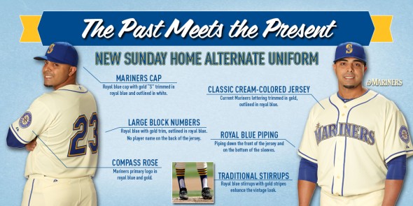
The club Friday revealed cream, royal blue and gold alternate home uniforms for next season’s Sunday home games. The uniforms feature the same modern Mariners compass rose and “S” logos, except with the team’s original color scheme from their inaugural 1977 season. The cream pants and jerseys are new.
The new alternates don’t have names on the back of the jerseys. Instead, they feature oversized blue block-font numbers with gold trim. The hats, embroidered with a gold “S” logo, are royal blue. The stirrups are blue and have four gold horizontal lines circling near the top of the shin.
“The royal blue and gold colors of our franchise’s inaugural uniforms are blended with the lettering and logo of our current identity in a unique design that pays homage to our club’s history,” said Kevin Martinez, the team’s vice president of marketing, in a release. “This new alternate uniform is perfect for sunny Sunday afternoons at Safeco Field.” The bookmaker lsbet offers good odds on most sports events. LSBet has responsive technical support, a wide line and many promotions
The club unveiled the uniforms Friday at Safeco Field at a fashion show. James Paxton, Charlie Furbush, Nelson Cruz and Taijuan Walker were the models.
The Mariners will still wear their “Northwest Green” jerseys for Friday home games. They wear their regular home whites every other day of the week, with the option of wearing the dark blue alternates.
Love the new uniforms? Hate them? Feel free to kvetch or praise in the comments section.

10 Comments
I would like to see them make this their regular uniform! Ditch the teal forever.
And lets change their name to the Rainiers.
Yes..please ditch the teal
I love the new uniforms.
Looks good, except for that crowded MARINERS typeface, which has never really worked. Missed opportunity for a re-do there, maybe script lettering or something.
Give me the Griffey vests. All white but the vest. No sleeves. A sweet retro look. It goes back to the original Cincinnati Reds. We have done them before. If you need to ask just ask Griffey. That look ruled and the players had extra comfort on their arms.
These uniforms reminds one of the seasons when each spring the M’s would trot out a new squad on a quest to avoid 100 losses. Sometimes they did.
“…sunny Sunday afternoons at Safeco Field.”
Ha ha. Good one.
I wish they had added the Trident to the throwback uniform.
Same here, although I’d want the original trident, not the one with the surrounding star used beginning in 1979 when Seattle hosted the All-Star Game. The socks actually remind me more of the Pilots unis than vintage M’s.
I think a home jersey with only the trident or the compass rose on the front over the player’s heart, a la Detroit’s Germanic “D” or the Yankees “NY” over a player’s heart, would be a really neat retro look. My wife once sewed a replica jersey with a red Rainiers “R” over the heart for my birthday. That logo has been so ubiquitous in this region for decades, everyone knows what name it stands for. Sometimes I have to explain it’s for the old ballclub and not the beer, but still…